
Data Visualization & Analysis
Use data to understand user stories, determine the business direction and
assist in decision making.
PROJECT 1
5 min read
U.S. global trade data visualization
Trade within the U.S. and other countries remains a critical topic in a wide variety of industries. This project was intended to create an informative data visualization that reveals important changes within world trade and assist in the decision-making process for the global trading partners.
Data Visualization Demo
PROCESS & RANTIONALE
I created the following sketches to explore some initial design ideas. There are a few things to consider in this data visualization design, it should be intuitive to present the information in an efficient way, and it needs to set up clear search conditions to help users filter the key information.

Idea 1

Idea 2
Design 1 focuses on exploring some interesting data and making comparisons. However, some variables have particular data while some have missing values. After team discussion, we did not choose the pie chart as it was too cluttered when we include all of the variables(e.g.export/import amounts).
Design 2 lacks comparisons and only shows the overall data. Filters need to be added to sort out the data and allow interactivity with the user. It does a great job in showing aggregates and summary statistics, showing the trading relationship between the world and US, but it lacks the ability to help users dig deeper into the dynamic industries and states represented on the map.
KEY FINDINGS


-
As shown above, most popular exports from the U.S. include goods in transportation and electronics.
-
China, Canada, and Mexico appear to be U.S. top trading partners, with China as the top exporter to the USA and Canada as the top recipient of USA exports.

-
Industries with manufacturing association generally stronger in the Southeast US.
-
The population generally correlated with higher imports and exports (e.g. California, Texas).

Unexpected is how big of an exporter Washington State is, considering its size is not at the top in terms of population. Trade surplus visible as a result. Aircraft most notably Boeing likely cause for this.

Exports are decreasing across most of the USA by year (from 2013 to 2016).
PROJECT 2
Yelp Review Insights
Seasonal factors(e.g. weather, holidays) can Influence the business, especially in the restaurant industry. This project aims to extract insights by visualizing the review trend and help business owners to understand and deal with the seasonality, such as adjusting marketing campaigns or staffing levels.

Challenge
The challenge is the sentiment analysis, which involves quantifying and interpreting the customer reviews that are associated with sentiments.

Dataset
-
5,200,000 user reviews
-
Information on 174,000 businesses
-
The data spans 11 metropolitan areas

Tools
-
Python for analyzing business star ratings
-
Tableau for analyzing customer reviews
Data Visualization
What are customers saying about my business? How are my business ratings trending over the years?
Aggregate amount of positive user reviews (2014-2017)
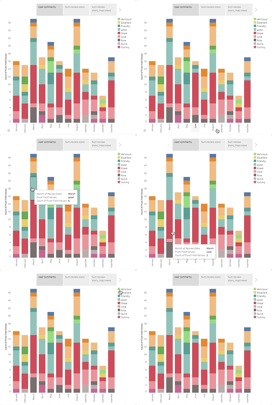
Distribution of positive reviews types

Seasonal impact on Yelp review ratings(2014-2017)
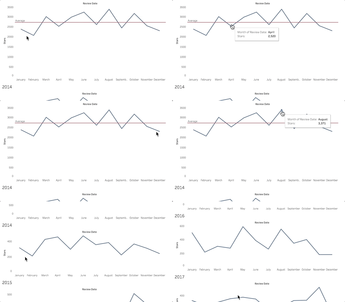
Standard deviation and mean star rating
.png)
Overall, we can conclude that yelp ratings will be at a peak during the summer months (June-August), and will decline during the winter months (November-March). The probability derived from the data implies that most reviews will be 3 or better, implying a positive review being expected.
Sentiments Analysis Can Be Tricky...
Review Sentiments Analysis


As shown above, although the review contained positive words like “great”, "fantastic". If sarcasm is used in a review, the context of the review can be very negative, without understanding its actual sentiment, this would be considered as a positive review.
As shown above, I used Tableau to extract the words from their context. Each word in the comment will be pulled out and put in a separate column. Now we have a single column with every individual word from each comment. The reviews contain that contains positive worlds such as "Great" will be considered as a "positive review", the number of positive reviews would indicate the success of businesses in that review month.
Discussions
Overall, we can concur that Yelp ratings will be at a peak during the summer months (June-August), and will decline during the winter months (November-March). This indicated that our hypotheses of seasons potentially affecting user reviews could be supported.
We realize that there are a variety of factors that can affect user reviews, such as holidays, severe weather, etc. These factors should be considered to make a sound judgment. Particularly, it appears that fewer reviews seem to take place during the wintertime, as people are more inclined to stay indoors, rather than going out.
Learnings
-
In UX research, A mixed-methods approach involves both quantitative and qualitative analysis provide a better understanding of data than either method can provide alone.
-
Data visualization is a powerful tool for explaining abstract information, and provide rational analysis to apply data-driven strategy to creating experiences